Conversion Rate Optimization Through Smart Digital Marketing Tactics
Are you getting traffic but no real results? It happens more than you think. You run ads. You post content. People visit. Then nothing. They leave. No clicks. No sales. No sign-ups. It feels frustrating, almost confusing. But here’s the thing, traffic alone is not the goal. Conversions are. And that’s where Conversion Rate Optimization (CRO) quietly changes the game.
Think of CRO like adjusting the small details in a shop. The lighting. The product placement. The way a salesperson greets you. Tiny things. But they matter a lot. Online, those “tiny things” are buttons, headlines, speed and trust signals. Ignore them, and you lose people fast. Fix them, and suddenly things start working. Not magically. But steadily.
What is Conversion Rate Optimization (CRO)?
CRO sounds technical. But really, it’s simple. It’s about getting more people to do what you want them to do. Buy. Sign up. Click. Stay longer.
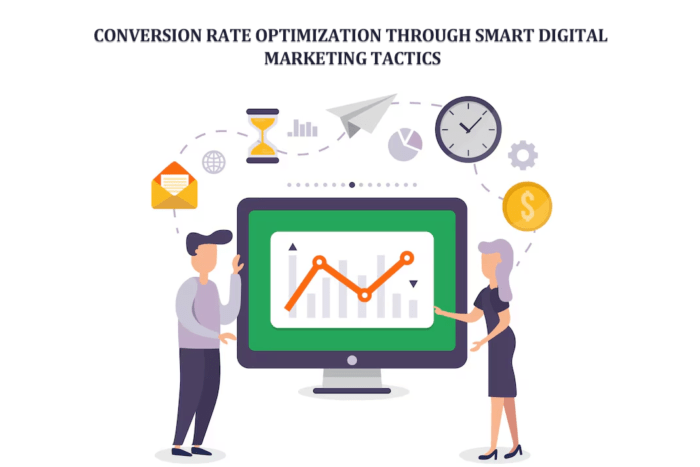
Imagine 100 people visit your site. Only 2 buy something. That’s a 2% conversion rate. Now imagine improving that to 4%. You didn’t get more traffic. But you doubled your results. That’s CRO. Quiet. Powerful. Often ignored.
And no, it’s not just changing colors or moving buttons around randomly. It’s testing. Observing. Fixing. Repeating. Sometimes it works instantly. Sometimes it doesn’t. That’s part of it.
Why CRO Matters in Digital Marketing
Ads are getting expensive. Attention spans? Getting shorter. So, wasting traffic, it hurts more now. CRO helps you:
- Get more value from every visitor
- Spend less on acquiring new users
- Build smoother experiences
- Turn casual visitors into actual customers
Think of it like this. You already paid to get people to your site. Why let them walk away? Also, when users enjoy your website, they come back. Simple. Not always predictable, but often true.
Understanding User Behavior
Let’s step into a user’s shoes for a moment. They click your link. Page loads. They look around. Scroll a bit. Then pause. Something feels off. Maybe slow speed. Maybe a confusing layout. Maybe too many choices. And then they leave. That’s behavior. And it tells a story. You need to watch closely:
- Where do users click?
- Where do they stop scrolling?
- Which pages do they exit quickly?
Sometimes the problem is obvious. Sometimes it’s subtle. Like a weak headline. Or a button that doesn’t stand out enough. Segment your users, too. Not everyone is the same. A first-time visitor behaves differently from a returning one. And treating them the same? That’s a mistake people often make.
Crafting High-Converting Landing Pages
A landing page is like a first impression. And we all know how that goes. You either connect or you don’t. You land on a page. Big bold headline. Clear message. You instantly understand what’s being offered. Feels easy. Comfortable. You stay. Now imagine the opposite. Confusing text. Too much clutter. No clear direction. You leave. Fast. To improve:
- Keep headlines sharp and direct
- Use strong CTAs like “Try Now” or “Start Free.”
- Avoid clutter. Less is often more
- Add proof (reviews, testimonials, results)
It’s not about being fancy. It’s about being clear. Clarity converts.
Role of A/B Testing
Here’s where things get interesting. Sometimes you think something will work. But it doesn’t. That’s why A/B testing exists.
You create two versions. Version A. Version B. Change one thing. Maybe the headline. Maybe the button color. Then see what people respond to. Simple idea. But powerful.
You’ll be surprised how small changes can make big differences. Or sometimes no difference at all. And that’s okay. You learn. Test things like:
- Headlines
- Images
- CTA placements
- Page structure
Don’t guess. Test. Always.
Leveraging Personalization
People like feeling understood. Not just sold to. Imagine visiting a site and seeing products that actually match your interests. Feels nice, right? That’s personalization. It’s not just about using someone’s name in an email. It goes deeper:
- Show relevant products
- Adjust content based on behavior
- Send tailored email campaigns
It creates a connection. And connection builds trust. Not instantly, but over time.
Optimizing for Mobile Users
Let’s be real. Most people are on their phones. Scrolling quickly. Tapping fast. If your site doesn’t work well on mobile, you’re losing them. No second chances here. Important things:
- Responsive design (must adjust to all screens)
- Fast loading speed (slow pages kill conversions)
- Simple navigation (no one wants to search too much)
Mobile users are impatient. You either keep up or you lose them.
Building Trust and Credibility
Trust is everything. Without it, nothing works. Imagine entering your credit card details on a site that looks sketchy. You wouldn’t. Nobody would. So, you need signals. Clear ones:
- HTTPS security
- Customer reviews
- Refund policies
- Real contact info
Even small details matter. A missing trust signal can create doubt. And doubt kills conversions. Quickly.
Power of Content Marketing
Now here’s where storytelling plays a big role. People don’t just buy products. They buy solutions. Experiences. Feelings. Content helps bridge that gap. A helpful blog post. A simple guide. A short video. These things educate and build trust slowly.
Sometimes, showing works better than telling. For instance, adding a WooCommerce product video plugin can bring products to life. Customers see how it works. They understand better. And when they understand, they feel more confident buying. Content isn’t just filler. It’s part of the journey.
Reducing Friction in the Conversion Funnel
Friction is that invisible resistance. The thing that makes users hesitate.
Too many form fields? Friction.
Complicated checkout? Friction.
Hidden costs? Big friction.
You want to remove as much of it as possible. Try this:
- Keep forms short
- Offer guest checkout
- Show pricing clearly
- Provide multiple payment options
The smoother the process, the better the results.
Utilizing Behavioral Triggers
Sometimes users need a little push. Not pressure. Just a nudge. That’s where behavioral triggers come in. Like when you’re about to leave a site and suddenly see an offer. That’s an exit-intent pop-up. It works more often than you’d expect. Other ideas:
- Limited-time deals (create urgency)
- Reminder emails
- Retargeting ads
These small triggers keep users engaged. And sometimes bring them back.
Measuring and Analyzing Performance
You can’t improve what you don’t track. Sounds obvious, but many ignore it. Look at your data regularly:
- Conversion rates
- Bounce rates
- Time on site
- Abandoned carts
Patterns start to appear. You notice what’s working. And what’s not. Then you adjust. Slowly. Carefully. CRO is not a one-time fix. It’s ongoing. Always evolving.
Common CRO Mistakes to Avoid
Even smart strategies fail sometimes. Usually because of simple mistakes. Watch out for these:
- Guessing instead of using data
- Overloading pages with info
- Ignoring mobile users
- Skipping testing
- Weak CTAs
These errors seem small. But they add up. And they hurt performance more than expected.
Conclusion
Why aren’t your visitors converting? It’s rarely one big problem. It’s many small ones. A slow page. A confusing layout. A weak message. Lack of trust. Each one is chipping away at your results. But the good part? You can fix them. Step by step. Test by test—improvement by improvement.
CRO is not flashy. It doesn’t promise overnight success. But it works. Quietly. Consistently. And over time, it turns your website into something powerful. Something that doesn’t just attract visitors but converts them. And honestly, that’s what really matters.